Thread Through Layers

You would think we’re born the moment we’re made, but it’s quite the opposite. A lot of us are never born, actually. Being made is quite different to us than living with a purpose. I came close to never finding out what it means to be alive and exist in my own objective. I vaguely remember the time before she chose me. It’s more like seeing an unfocused video compared to what I see and experience now. Part of that experience before also didn’t allow me to see. I was in darkness for quite a bit of it. I could only ever overhear conversations with no direction, feel myself being picked up and moved around. But I was never the center of the story. 

I first met her briefly, during a warm afternoon. I heard the bells ring, signaling an onslaught of possibilities. Those bells were honestly getting on my nerves at this point. Her laugh stood out first. She sounded different, different than those before her. A ping of hope clashed with my obnoxious inner voice. Another voice came towards me and picked me up immediately. I was brought out to her and that’s when we first met. She purred with compliments and walked me around the room to show off how well we got on. Warnings came near her, of my color, of what I was made of and the risk she would be taking if she would really accept me. Apparently, she wasn’t different enough and her sounding voices won against taking me with her. But I knew, she had that look in her eye. A look that made me feel like I would see her again. 

She took me without even trying me on and ran as fast as she could home. Once there, she let me breathe and removed me from the cell that had contained me ever since I was made. Placing me among the others, I could tell she really did take a risk with me. There I was shiny and white, leather skin and white soles and laces that evenly crossed to the pretty bow at top. Compared to me, the few other pairs she displayed on her wall were rough, black and heavy. Still elegant, and with a heel but all showed how well she cared for them despite their outward appearance. My peers warned me somberly that I would be her closest companion now and would get to finally live and see the world and how I had to take care of her for she was special and an adventurer. No one here would sit absentmindedly. 

Our first day together was evidence to their warnings. She did not tread lightly. She ran and jumped and walked further and faster than those around her. My shiny white exterior quite quickly became rough and slashed with experiences and evidence of the life I lived everyday with her. But, I would never complain and offered her as much support and protection as I could. 

I knew I wasn’t a choice she would make normally make. She was taking a chance on me and expected me to be different and I had to live up to that task. I couldn’t be like the rest, I had to stand out in a way that would make her feel special. Like she truly found a jewel no one bothered to notice. 

From white and shiny, to grey and unlayered, I feared she would begin to see the ugliness in me. I was brought out less and sat once again in a dark room. I wondered if this was a reflection of what she initially wanted from me. A jewel unlike the rest, but once the world had seen it, its value meant nothing anymore. 

Summer once again, her voice came closer to me and she did not hesitate to choose me. See, regardless of how the world grew and overshadowed on my skin, she saw it as beauty and an example of how far we’ve come together. I’ve become her favorite companion, one she can always and will always depend on even if my layers and white skin eventually disappear. 

The Newspaper-print Leather Gloves: John Galliano Design His Own Story

French fashion houses are known to sit at the top of the food chain in the fashion world and Cristian Dior, better known today as Dior, is one of the biggest beasts of all. Founded in 1956 by designer Christian Dior, the label is known for being a staple of haute couture since its’ establishment. Famous for creating shapes and silhouettes, Dior was a master at construction and details that initially gave his models a curvaceous look with the attention focused on tiny waists and proper attire. Long after Dior’s death, designer John Galliano took the helm of the brand in 1996 after a previous two-year stint at Givenchy. Galliano today is someone who shaped the fashion industry. He is also someone who has always been in the spotlight, whether for good or bad. In the year 2000, Galliano designed for Dior a pair of newspaper-print leather gloves that defined and reflected how he thought the media and world saw him, and how only he could control his image first and foremost. 

Today, the gloves are exhibited in A History of Fashion in 100 Objects at the Fashion Museum Bath in England. As labeled in the title of the exhibition, the gloves truly reflect a moment in Galliano’s career as he used Dior and its style to write his own story. The 20-year-old leather gloves allow viewers to read, quite literally, Galliano’s thoughts and statements of the current media height and surrounding culture. Leather gloves themselves as quite a normal staple for Dior and quite appropriately for the year 2000 when the inspiration of the fashion industry itself was wacky and modern with hints of historical fashion. From the smoothness of the top grain of the gloves, they were made of calf leather, especially considering how thin the material would have to be to fit on a women’s hand and allow for mobility of her fingers. There’s no top stitching, which is an ode to Dior’s clean aesthetic and wanting to hide an evidence of construction to give the item a luxury appeal, even though such an intricate thing was handmade. Though the inside of the gloves is not shown, there should be a lining of light silk as that would, again, be a staple of Dior’s choice of construction and necessary to protect the hands from the coarseness of the suede or underside of the leather.

What is most important though, is the newspaper print on top of the gloves. The print depicts a typical remnant of a newspaper through the font type, size and spacing, the multiple column of text and lines and layout details. The first thing to catch someone’s eyes is Galliano’s name printed largely right underneath the thumb. The word Gazette is printed across the palm in the typical Helvetica font, consisting of decorative letters. It’s interesting to note the lack of Christian Dior’s name. This is because though the gloves were made for Dior, and this is found though the construction itself, the print of the gloves is used to playfully throwback the media’s scrutiny of Galliano, in a quite docile embodiment of gloves for a woman. 

The custom-wrapped newspaper box houses the gloves within carefully wrapped silk newspaper-print paper, mimicking the print on the gloves to a more literal extent. It’s the perfect companion and almost equally as important in statement as the gloves themselves. The box light-tan colored box depicts a traditional newspaper, titled International Galliano Gazette. It includes articles like, “Let Uncle Send-Me-The-Bill explain all…,” “The Show Must Go On…,” and “Culture vulture.” Each title gives away a bit of Galliano’s personality and ease in picking at himself as he quite clearly knows what the media and would expect of him. 

Like most on top, the media watches carefully and scrutinizes anything that could lead to moving along a story. For example, the article titled “Culture vulture” and “The Show Must Go On…” could be about the extreme pressure on designers to fabricate new collections 6-12 times per year. Any designer would be burnt out from the weight of the job itself, but for someone who is carefully being watched who sits at the very top of one of the biggest fashion houses is the world the burden must be unimaginable. Yet, Galliano stands strong and uses his artform of designing within the brand of Dior to showcase his own story and the truth of himself. 

Best Five Looks Showcased by Valentino on Animal Crossing

The spring/summer season of runway shows has come to a complete halt. Not only has the world been placed on a pause, but hereafter, the fashion industry will come to look quite differently. Amid the chaos, some have wisely chosen to adapt in a lighthearted and fun way. Animal Crossings: New Horizon launched for the Nintendo Switch in March. It was the perfect game for the world to escape to amid the pandemic, especially the fashion world. Many brands and fans alike have taken to the virtual world to showcase, share and create what would’ve been the s/s 2020 collections. The following are five looks Valentino premiered on Animal Crossing.

animal-crossing-valentino-16.jpeg

The Spring/Summer 2020 collection launched on Animal Crossing for Valentino and made headlines. When a brand launches a collection, they make the most money out of simple items like T-shirts and accessories as more people are willing to spend on something they can afford. It’s ironic, however, how this is mimicked in the virtual world even if the items have no price. The crowd favorite from the collection was this simple look — a black bucket hat and white T-shirt with Valentino written on it. Maybe it comes from have the logo front and center so all can recognize it, or simply the transition of the incoming style that reflects the outmost simplicity, this look is definitely one of my favorites. What’s interesting about Animal Crossing is how many people make it more normal instead of giving into complete fantasy. Their islands and characters are made to look how the person playing the game would look and live like. This uniform of an outfit reflects that well. The star on the bucket hat is also a cute touch that stands out well.

animal-crossing-valentino-11.jpeg

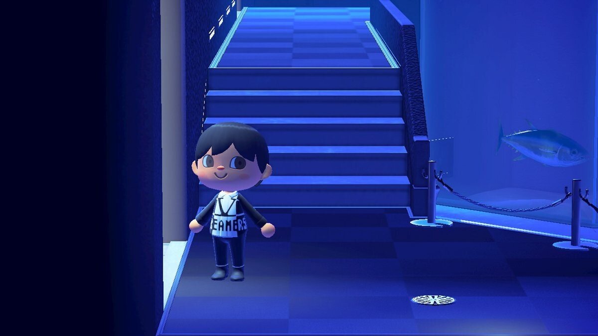
Continuing with a more simplistic and logo-centric look, this button-down dress shirt is paired with black slacks and black pleather boots (I know, it’s it incredible how a virtual game would care is leather-like boots are made out of actual leather or not). The details of the shirt, from the collar to the center seam fold hiding the buttons exemplifies how well some items are translated into the virtual world. Then the print on the shirt is shown in both black and white splitting at what would be the princess seam. The chic dress shirt dons a “V” for Valentino and the word “DREAMERS” underneath. Here, you start to see the limitations of translating a print or word on such a small surface space and how it may begin to distort or appear pixelated. This is because the way you create garments in Animal Crossing is actually like sewing small one inch squares, so the appearance of pixelation is to be expected. Nonetheless, I think this is such a great look that many users could enjoy wearing and styling with fun items.

animal-crossing-valentino-15.jpeg

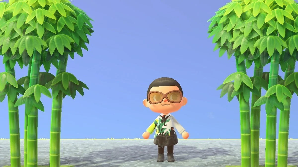
Abstract prints have been a big part of Valentino’s latest collection. Like I mentioned before, sometimes the print is a hit or miss. Here, it’s clearly a hit. The collarless overcoat dons the collections color palette well as it morphs from black to white to lime green. The details of the jacket, especially in the print, make it so exciting to see. Translating a motif onto such a small surface area has been proven to be difficult but here it gives the Animal Crossing wearer a sense of futuristic vibes that match well with the virtual environment. This look is also paired with black slacks and black pleather boots, possibly hinting at the expected uniform color of the fashion industry, or simply wanting just the jacket to stand out. The over-sized light-brown glasses are the cherry on top for the look. The environment that surrounds the character of bamboo trees and grey brick pathways make for the perfect photoshoot as well.

animal-crossing-valentino-08.jpeg

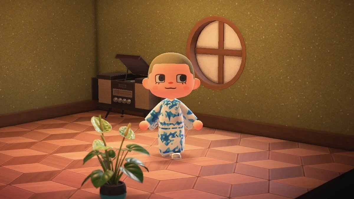
Here’s an example of how prints and looks can get lost when being translated into such a specific and limited virtual space. The actual dress has many more details, but the print and large shape of the dress drown the character. The limited color palette also hide whatever design details may have been added but are no longer seen. The silhouette design of the dress is not flattering for the character at all. The kimono sleeve drape awkwardly behind the character and exaggerate the proportions in a weird shape. It would’ve been better if the sleeve where tight and normal rather than how they look now. The print is also a bit too abstract where it loses value and understanding. This design would have been more successful if translated into a dress shirt or bomber jacket, or even if the print was used for a bucket hat.

animal-crossing-valentino-12.jpeg

What would’ve been a stand-out finale look is a crowd-favorite (as expected) with Animal Crossing users and Valentino fans alike. The lime-green princess dress stands out in its refreshing essence that mimics the brightness and rebirth of spring. Who would’ve thought spring colors could include a neon hue so perfectly? It’s refreshing in the sense that it does stand out from what a typical summer dress would be. The color is influenced from the collection’s color palette and as a finale dress, it is only evident it stand out. The shape was recreated well and even includes the puff sleeves and waist belt detail. The scalloped bell-shaped skirt of the dress fits the cute characters of Animal Crossing well. If you thought dressing humans was hard, imagine a virtual game where textures and details may not translate well. Valentino does well in recreating only a few details and not getting carried away to honestly copy the dress into the game. The white socks ankle socks and sparkly gray ballet flats compliment and finish off the look with style and elegance.